
Color trends come and go every season, but this year we’re seeing some particularly exciting shades make their way into the spotlight. Whether your style sensibilities lean towards muted pastels or bold brights, there are fresh and vibrant color options this year that can definitely enlighten your personal style. From retro shades making a comeback to complementary color pairings, read on to discover the new color trends you should have on your radar right now.
Pastel Colors Trend
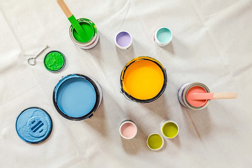
Pastels are back in a big way, taking center stage across both fashion and home decor. If you find soft, subdued shades to be soothing and uplifting, you’ll love incorporating the latest pastel color trend into your wardrobe and living spaces.
Some of the specific dreamy pastels that are popular this year include lilac, sage green, pale pink, and buttery yellow. These shades pair beautifully together in floral prints, color blocking, and home accessories.
Pastels add a whisper of subtle color without being overpowering. They have an inherently optimistic and uplifting effect. Adding pastels into your style is a great way to cultivate a sense of harmony in both your appearance and environment.
You can break up all that pastel prettiness with some white space and metallic touches. This helps keep the look from becoming overly saccharine.
In your home, use pastels in key accent pieces like throw pillows, area rugs, and art. When it comes to clothing, all pastel everything can be hard to pull off. Instead, choose one pastel statement piece at a time to mix in with other neutrals and earth tones.
Vibrant Hues Trend
At the other end of the color spectrum, bold vibrant hues are also having a major moment this year. Think lush citrus oranges, electric cobalt blues, and vivid Kelly greens. After years of more muted “millennial pink” and other dusty tones ruling supreme, people are ready to embrace more saturated shades again.
The vibrant color trend brings energy and flair. These eye-catching colors have youthful appeal. They feel lively, fun and fearless.
It’s best to incorporate these vivid colors in judicious pops so they don’t overwhelm the senses. Try a vibrant mini bag to add a punch of color to a neutral outfit. Or pick one key garment in a saturated shade, like an orange blazer or fuchsia dress.
For your home, add small vibrant accents like throw blankets, accent chairs or even kitchen appliances. Just one or two bold colorful pieces can enliven an entire space.
Don’t be afraid to mix and match different vibrant hues together. Orange and pink create a trendy “creamsicle” pairing, while yellow and teal have a playful tropical vibe.
Retro Color Comeback
Get ready to go back in time with the retro color comeback happening right now. Shades straight from the 1960s and 70s are being embraced again in fun, fresh ways.
Mustard yellow, burnt orange, avocado green, shag carpet pink…these nostalgic brights defined past eras and now they’re enjoying modern revival. Two design aesthetics are bringing retro colors back:
- The mid century modern look, with its Scandinavian minimalism and groovy 70s edge. Lots of retro burnt orange, mustard, minty greens and peachy pinks.
- The cottagecore trend inspired by a cozy, whimsical grandmother’s house. We’re talking retro pastel yellow, sage green, and powder blue hues.
Both of these design styles have sparked new appreciation for retro color palettes. The nostalgic, funky vibes of these shades feel playful and unique.
To wear retro colors today in a current way, try pairing a mustard yellow sweater with dark denim jeans, or an a-line burnt orange dress with lace up boots. Use retro shades in fun patterns and prints like polka dots, floral and gingham. Wide leg pants, puff sleeves and floppy hats also bridge retro with modern when done in retro hues.
In your home, lean into retro colors in your kitchen and bedroom textiles especially. Vintage-looking area rugs, quilts and accent chairs covered in retro prints can nail the aesthetic. Just keep the overall palette coherent.
Complementary Color Pairings
Using complementary colors – shade pairs opposite each other on the color wheel – is an easy way to create striking, sophisticated color combinations. The contrast pops.
Some examples of complementary color pairs include:
- Red and green
- Orange and blue
- Yellow and purple
- Pink and green
Working these complementary duos into your wardrobe and home decor instantly elevates the look. The colors balance each other, letting both shine.
In fashion, wearing a red jacket with an emerald green skirt makes a bold color statement. Using patterns like gingham or florals that contain complementing shade contrasts can also be effective.
At home, paint an accent wall in a saturated orange and then decorate with blue area rugs and throw pillows. The two tones play off each other beautifully. Use yellow dishes and purple napkins for a complementary table setting.
When combining any strong colors, including complementary shades, be sure to give them room to breathe. Adjacent blocks of color work better than mixing patterns that contain both colors, which can become visually overwhelming.
Let one color take center stage, like a burnt orange sofa, then add accents of the blue complement like pillows and a rug. The accent color enhances versus competes with the main shade.
The color trends for this year offer fresh, vibrant options whether your personal style leans toward muted or saturated hues.
Pastels provide a soothing oasis of optimism and harmony. Retro brights and neon vibrancy inject playful energy. Complementary color pairings lend striking sophistication.
Use these color trends thoughtfully to create stylish, uplifting palettes. Don’t be afraid to mix and match either – soft pastels with vivid brights or retro shades can yield beautiful results.
At the heart of it, embracing new color trends comes down to having fun and expressing your unique style. Experiment, get inspired and see where these fresh shades take you.
Color has the power to truly enlighten and transform our style and spaces when used creatively. Hopefully these on-trend color ideas have sparked some ideas you’re excited to try.
Let me know if you would like me to modify or expand any part of this blog post draft. I’m happy to keep refining it until it aligns with your vision.